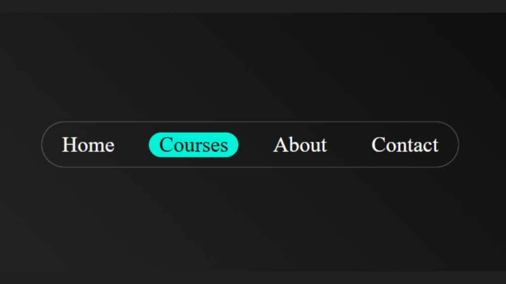
Hello, coders in this article we’re going to create an animated Nav Bar using HTML and CSS!
Hope you love this Project, This project is best for beginners who are willing to jump into a development career
ok let’s dive into it
You can get Handwritten Notes for free visit here
Output
Animated Nav Bar HTML code:
This is the HTML code for our Animated Nav Bar. Here we created a wrapper div that contains the Nav section and in that, we created ul and li lists
<!DOCTYPE html>
<html lang="en">
<head>
    <meta charset="UTF-8">
    <meta name="viewport" content="width=device-width, initial-scale=1.0">
    <title>Document</title>
    <link rel="stylesheet" href="styles.css">
</head>
<body>
    <div class="wrapper">
        <nav>
            <ul>
            <li>Home</li>
            <li>Courses</li>
            <li>About</li>
            <li>Contact</li>
        </ul>
        </nav>
    </div>
</body>
</html>
Animated Nav Bar CSS code:
* {
  padding: 0;
  margin: 0;
  box-sizing: border-box;
}
.wrapper {
  height: 100vh;
  display: flex;
  align-items: center;
  justify-content: center;
  background: linear-gradient(45deg, #323232, black);
}
ul {
  box-shadow: 0px 0px 1px white;
  background-color: transparent;
  border-radius: 30px;
}
nav li {
  list-style: none;
  display: inline-block;
  font-size: 1.3rem;
  margin: 0.6rem;
  width: min-content;
  padding: 0px 10px;
  border-radius: 1px;
  color: white;
  cursor: pointer;
  transition: 0.3s ease-in-out;
}
li:hover {
  transition: 0.4s ease-in-out;
  background: rgb(4, 240, 216);
  color: rgb(7, 7, 7);
  border-radius: 30px;
  transition: 0.3s ease-in-out;
}

@media (max-width: 640px) {
  nav li {
    display: flex;
    border-radius: 0px;
  }
  ul {
    padding: 1rem 0rem;
  }
}
This is the CSS code where we add our actual code to create an Animated Nav Bar
Download the source of the Animated Nav Bar

I’m a Full-Stack web developer (Freelancer). I’ve a great knowledge of anything related to HTML, CSS, JS, React, Node.js, MongoDB


