You want to create a Simple Animated navigation bar using HTML & CSS? – You’re in the right place
In this guide, I’ll explain everything about the animated navigation bar step by step. In this guide we’re not creating a simple nav bar; we also add some moves and animations when the user clicks on it.
Before we dive into the actual project, let’s talk about something important!
Building Animated navigation bar
Types of Nav Bars
In the web dev world, we call the navigation bar as “Nav Bar” – Mainly, there are four types of nav bars
- Horizontal Nav bar – It is top of the page
- Vertical Nav bar – It looks like a sidebar
- Sticky Nav bar – It sticks on top when the user scrolls
- Responsive Nav bar -Which is responsive on all devices, like laptops, mobiles, tablets
In this guide, I’m ready to create a Horizontal nav bar with animations. I think you’ll get some idea of Nav bars right!
Okay, let’s jump into the actual project
Also read:
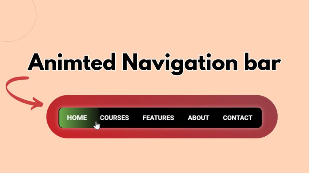
Project Preview of Animated Navigation Bar
1. Setting Up Project Structure
Before we write code, we need to make our workspace clean and neat. Here I’m using VS Code for this project
Folder setup:
- Create a folder name, it’s up to your choice. I name it
animated-navbar - Inside that folder, create two files
index.html file for HTML structurestyles.cssfor our CSS code
It’s time to connect our CSS file to HTML document
How to connect CSS to an HTML document:
<!DOCTYPE html>
<html lang="en">
  <head>
    <meta charset="UTF-8" />
    <meta name="viewport" content="width=device-width, initial-scale=1.0" />
    <title>Animated nav bar</title>
    <link rel="stylesheet" href="styles.css" /> //Here I'm both HTML & CSS//
  </head>
2. Designing HTML structure
Let’s build a skeleton for our Animated Nav bar on HTML. Keep it easy and clean!
This is our basic setup:
 <body>
    <nav class="navbar">
      <ul>
        <li><a href="">Home</a></li>
        <li><a href="">Courses</a></li>
        <li><a href="">features</a></li>
        <li><a href="">about</a></li>
        <li><a href="">contact</a></li>
        <div class="bg"></div>
      </ul>
    </nav>
  </body>
After we connect both HTML and CSS on <head> tag. Let’s add some code in <body> tag
Quick explanation of the HTML code:
navbar– This is like a container for Navigation linksul– It creates unordered listsli– We are adding our list items like Home, courses, features, about and more
3. Styling Navigation bar with CSS
Alright, let’s see how we transform this HTML code with pure CSS.
Let’s style the navbar:
@import url("https://fonts.googleapis.com/css2?family=Roboto:ital,wght@0,100;0,300;0,400;0,500;0,700;0,900;1,100;1,300;1,400;1,500;1,700;1,900&display=swap");

* {
  padding: 0;
  margin: 0;
  box-sizing: border-box;
  font-family: "Roboto", sans-serif;
}
.navbar {
  position: relative;
  width: 500px;
  height: 50px;
  border-radius: 10px;
  background: rgb(0, 0, 0);
  box-shadow: 0px 0px 10px rgba(255, 255, 255, 0.5);
  display: flex;
  justify-content: center;
  align-items: center;
}
.navbar ul {
  list-style: none;
  display: inline-block;
  z-index: 1;
  cursor: pointer;
}
Quick explanation of the CSS code:
Nav bar:
- Google fonts: I’ve added Google fonts(Roboto)
navbar: I’ll give the position relative so that we can put it anywhere later.flexbox: To keep everything centredbox-shadow: Adding box shadow
Nav bar ul:
list-style: we make it none, because no styles are applied to the list style like dots, numbers etc…z-index: Bring all items on topcursor: I’ll make it pointer (it depends on you)
Now let’s touch the list:
.navbar li {
  display: inline-block;
  padding: 0 15px;
  text-align: center;
  z-index: 10;
  transition: transform 300ms ease;
}
a {
  position: relative;
  text-decoration: none;
  color: white;
  font-weight: 600;
  text-transform: uppercase;
}
.bg {
  position: absolute;
  left: 0;
  top: 0;
  height: 100%;
  z-index: -1;
  background: linear-gradient(90deg, rgb(107, 171, 74), rgb(17, 21, 13));
  border-radius: 10px;
  transition: all 500ms ease 0s;
}
For li itmes, make content center and add some smooth aniations
For a anchor tag, make text decoration to none(like without underline, througline)
For background, I’m adding linear background with transitions
3. Hover Animation with CSS
li:hover {
  transform: scalex(1.09);
  transition: transform 300ms ease;
}
Here, I’ve added hover transform and transitions when user hover on list items
let’s move to hover animation:
li:nth-child(1):hover ~ .bg {
  width: 100px;
  left: 0;
}

li:nth-child(2):hover ~ .bg {
  width: 90px;
  left: 95px;
}

li:nth-child(3):hover ~ .bg {
  width: 110px;
  left: 190px;
}

li:nth-child(4):hover ~ .bg {
  width: 90px;
  left: 300px;
}

li:nth-child(5):hover ~ .bg {
  width: 110px;
  left: 390px;
}
When user hover on list items a smooth background animates like rainbow
There we go!
now we successfully created a animated nav bar using pure HTMl and css
Mistaked to avoid while creating Navigation bar
- Don’t do Over animations
- Poor contrast – make sure the text is easy to read
- Mobile friendly – make mobile responsive
- Don’t froget to test on different platforms like chrome, safari, firefox
Final thoughts
Now you’ve learned about creating a Animated navigation bar using HTML CSS.
This navigation bar is just a beginning! If you’re into web development domain make sure to lean and build anything from scratch with your own thoughts.
Now you need to recreate this Animated nav bar with different colors, texts, animations and trasitions
Please don’t forget to leave a comment

I’m a Full-Stack web developer (Freelancer). I’ve a great knowledge of anything related to HTML, CSS, JS, React, Node.js, MongoDB