Hi this is Imraan welcome to my new article here I’m going to show you how you can create a CSS animation button using HTML, CSS
Let’s dive into it!
you can find the full source code here – Source code
HTML code
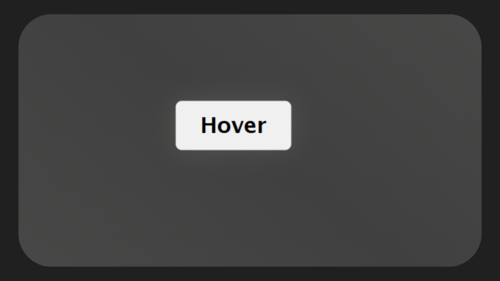
In our HTML we only add a button element, and I named it as HOVER–
<!DOCTYPE html>
<html lang="en">
<head>
    <meta charset="UTF-8">
    <meta name="viewport" content="width=device-width, initial-scale=1.0">
    <title>Button 1</title>
    <link rel="stylesheet" href="styles.css">
</head>
<body>
    <button>
        Hover
    </button>
</body>
</html>
CSS code
Here’s where the real fun begins!
In CSS, we use transition and Box-shadow to our button then we add some hover effect to that box where you can see the full code.
* {
  padding: 0;
  margin: 0;
  box-sizing: border-box;
  font-family: "Lucida Sans", "Lucida Sans Regular", "Lucida Grande",
    "Lucida Sans Unicode", Geneva, Verdana, sans-serif;
}
body {
  height: 100vh;
  display: flex;
  justify-content: center;
  align-items: center;
  background: linear-gradient(
    40deg,
    rgb(86, 87, 84),
    rgb(63, 64, 63),
    rgb(86, 87, 84)
  );
}
button {
  outline: 0;
  border: 0;
  font-size: 1.1rem;
  font-weight: 700;
  padding: 10px 20px;
  border-radius: 5px;
  cursor: pointer;
  color: black;
  transition: all 0.2s ease-in-out;
  box-shadow: rgba(0, 0, 0, 0.17) 0px -23px 25px 0px inset,
    rgba(0, 0, 0, 0.15) 0px -36px 30px 0px inset,
    rgba(0, 0, 0, 0.1) 0px -79px 40px 0px inset, rgba(0, 0, 0, 0.06) 0px 2px 1px,
    rgba(0, 0, 0, 0.09) 0px 4px 2px, rgba(0, 0, 0, 0.09) 0px 8px 4px,
    rgba(0, 0, 0, 0.09) 0px 16px 8px, rgba(0, 0, 0, 0.09) 0px 32px 16px;
}
button:hover {
  color: black;
  transform: scale(1.09);
  box-shadow: 0px 0px 20px rgb(87, 84, 84);
}
Wrapping up
That’s it we successfully created a CSS hover animation button using HTML, CSS

I’m a Full-Stack web developer (Freelancer). I’ve a great knowledge of anything related to HTML, CSS, JS, React, Node.js, MongoDB