Hello coders, We can learn about creating a simple flip card using HTML and CSS in this project. If you’re a developer cards are necessary to practice
Here I provide simple code to understand and learn
Let’s jump on it!
HTML
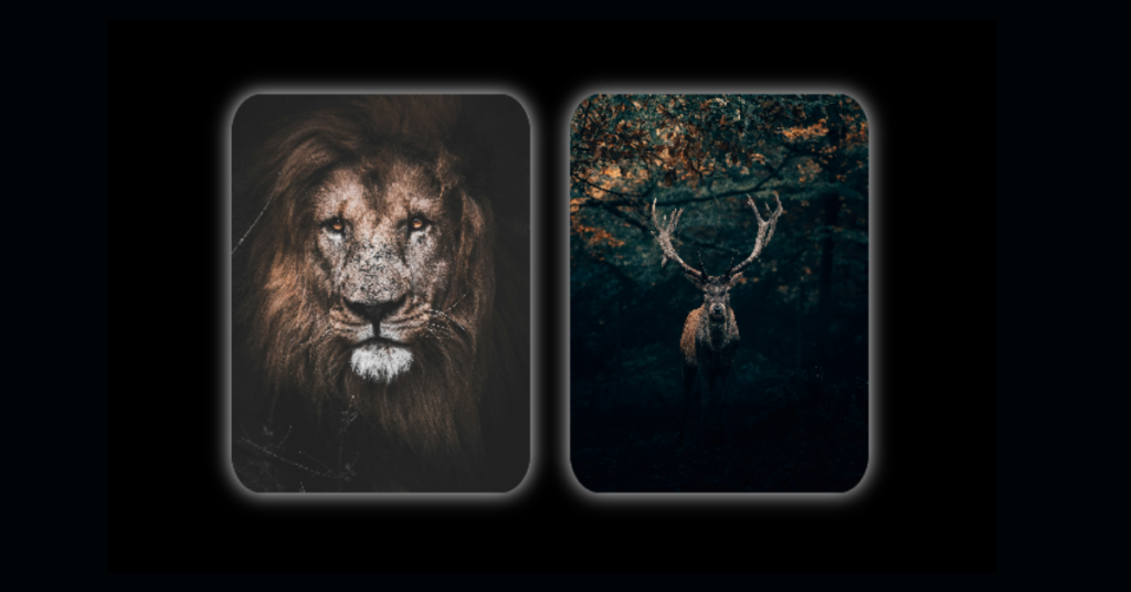
This is the HTML code for the Flip card, Here I took simple Card Divs and added images to it, the skeleton for this project is simple
<!DOCTYPE html>
<html lang="en">
  <head>
    <meta charset="UTF-8" />
    <meta name="viewport" content="width=device-width, initial-scale=1.0" />
    <title>FlipCard</title>
    <link rel="stylesheet" href="styles.css" />
  </head>
  <body>
    <div class="card-1">
      <div class="front-face-1">
        <img src="lion.jpg" alt="" />
      </div>
      <div class="back-face-1">
        <span>If you want to be a lion, you have to train with lions</span>
      </div>

      <!-- Card 2 -->
    </div>

    <div class="card-2">
      <div class="front-face-2">
        <img src="deer.jpg" alt="" />
      </div>
      <div class="back-face-2">
        <span> A Wounded Deer Leaps the Highest</span>
      </div>
    </div>
  </body>
</html>
CSS
Let’s jump to CSS, this is where you will find some tricky and confusing properties, if you try this out you can easily master it. I hope you you understand this code, if not feel free to comment down
* {
  padding: 0;
  margin: 0;
  box-sizing: border-box;
}
body {
  height: 100vh;
  background: black;
  display: flex;
  justify-content: center;
  align-items: center;
  perspective: 300px;
  gap: 20px;
}
.card-1 {
  position: relative;
  width: 150px;
  height: 200px;
  transition: transform 0.5s;
  transform-style: preserve-3d;
  cursor: pointer;
}

.card-1 img {
  position: absolute;
  height: 100%;
  width: 100%;
  object-fit: cover;
}
.front-face-1 {
  position: absolute;
  height: 100%;
  width: 100%;
  box-shadow: 0px 0px 10px white;
  backface-visibility: hidden;
  border-radius: 10%;
  overflow: hidden;
}

.back-face-1 {
  position: absolute;
  height: 100%;
  width: 100%;
  padding: 10px;
  display: flex;
  align-items: center;
  justify-content: center;
  box-shadow: 0px 0px 10px white;
  text-align: center;
  backface-visibility: hidden;
  border-radius: 10%;
  background: white;
}
.back-face-1 span {
  color: white;
  font-weight: 800;
  text-transform: uppercase;
  background: black;
  transition: all 0.4s;
}
.back-face-1 span:hover {
  transform: scale(1.06);
  border-top-left-radius: 15px;
  border-bottom-right-radius: 15px;
  color: white;
  background: #2f2e2e;
}

.card-1:hover,
.back-face-1 {
  transform: rotatey(-180deg);
}

/* card 2 */

.card-2 {
  position: relative;
  width: 150px;
  height: 200px;
  transition: transform 0.5s;
  transform-style: preserve-3d;
  cursor: pointer;
}

.card-2 img {
  position: absolute;
  height: 100%;
  width: 100%;
  object-fit: cover;
}
.front-face-2 {
  position: absolute;
  height: 100%;
  width: 100%;
  box-shadow: 0px 0px 10px white;
  backface-visibility: hidden;
  border-radius: 10%;
  overflow: hidden;
}
.back-face-2 {
  position: absolute;
  height: 100%;
  width: 100%;
  padding: 10px;
  display: flex;
  align-items: center;
  justify-content: center;
  box-shadow: 0px 0px 10px white;
  text-align: center;
  backface-visibility: hidden;
  border-radius: 10%;
  background: white;
}
.back-face-2 span {
  color: white;
  font-weight: 800;
  text-transform: uppercase;
  background: black;
  transition: all 0.4s;
}
.back-face-2 span:hover {
  transform: scale(1.06);
  border-top-left-radius: 15px;
  border-bottom-right-radius: 15px;
  color: white;
  background: #2f2e2e;
}
.card-2:hover,
.back-face-2 {
  transform: rotatey(-180deg);
}
that’s it there we go, with the help of HTML and CSS we created a simple flip card – if you love this project comment down appreciation
NOTE:-
Experiment with different background images and CSS properties to perfect your design. Happy coding, and enjoy the creativity of building your FLIP CARD
All the images and source code are uploaded here you can check it out

I’m a Full-Stack web developer (Freelancer). I’ve a great knowledge of anything related to HTML, CSS, JS, React, Node.js, MongoDB